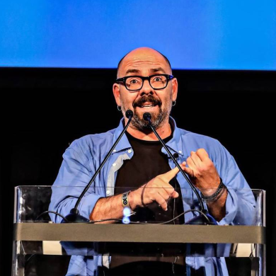
Calling Karin Fong “the Saul Bass of her generation” may be a little rich. But other than the mentors that shepherded her, she has few superiors, let alone equals, in the realm of title design. But in person, she’s quite humble and humorous. “If you need someone to whip up a title or dream sequence – well, I’m your gal!” Fong exclaims as she nibbles on a beet salad at an eatery in Los Angeles’ Silver Lake neighborhood.
Fong is a truly multi-faceted artist and filmmaking professional. She studied art and design at Yale before graduating into the world of title design; she’s also had a substantial career as a director and spent a stint as chief creative officer for one of her frequent collaborators, the director McG. Of course, they met on McG’s first movie, Charlie’s Angels, for which Fong did the title sequence.
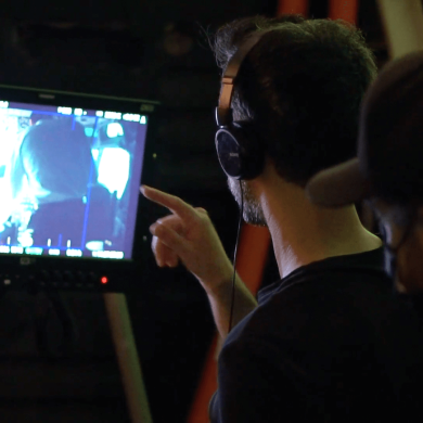
Indeed, title sequences have become Fong’s paintbrush and canvas. In them, she creates dreamlike, often playful, and surrealist interpretations of a film or TV show’s narrative – they haunt you well after the credits roll – sometimes more than the actual story they’re introducing! Fong is also one of the founding members of the prestigious Imaginary Forces – a self-proclaimed “creative company specializing in visual storytelling and brand strategy.” In addition to creating state-of-the-art titles (the brilliant Stranger Things title sequence is a recent Imaginary Forces creation), Imaginary Forces has grown into a multimedia behemoth covering all aspects of filmmaking, from virtual reality to YouTube and beyond. Here, CreativeFuture sits with Fong over a drink and nosh to learn what inspires her visionary world.
 CreativeFuture: So, how would you describe what Imaginary Forces does? How did it start, and what has it become today?
Karin Fong: Simply put, we think of ideas, develop them, and make stuff, all while looking through the lens of design. One thing I’ve always enjoyed is that we are screen agnostic: we’ve designed and produced content for formats as small as a smartphone to work that spans the side of a building. For us, it’s about making work that is emotionally resonant, that speaks to the essence of an idea or story.
In the beginning, we were the West Coast branch of R/Greenberg Associates. Back then, that studio was well known for its title and trailer designs. As R/GA’s focus shifted, we left and became Imaginary Forces in 1996. At first our claim to fame was indeed the sequences we created for film and TV. And then that led to producing commercials, brand films, immersive environments, and eventually to the creation of all kinds of content, both short and long-form.
I’d come to R/GA from working in television. I did animation for a show called Where in the World is Carmen Sandiego? for WGBH in Boston. Carmen Sandiego taught kids about geography. What led to this job in public television was an animated alphabet book I did when I was in college at Yale University.
CF: What did you study at Yale?
KF: I studied studio art, with a focus on design there. This was the golden age of CD-ROMs. Everybody thought we were all not going to have books, and we were all going to learn everything from CD-ROMs – which kind of came true, except they’re called apps now. But back then everyone was crazy about CD-ROMs, so I started making this animated alphabet book because I thought that would be the perfect medium to teach kids how to read.
CF: What was your inspiration?
KF: I love things done for children because kids are natural surrealists. I love Schoolhouse Rock! Oh my gosh, I just turned my kids onto it – it’s in constant rotation in our family car. I still have a Schoolhouse Rock! VHS from olden days. And I had always been a Sesame Street fanatic. My hero is Joan Ganz Cooney, who invented Sesame Street.
Today, we have whole channels of edutainment, but back in 1969 it was novel – especially the way she was blending education and storytelling, and the way she was using advertising techniques and interesting animation and typography, and finding the guy who did Muppets – it was all very revolutionary, in this very concise, visual, fun-filled format. It was a wonderful way to see the world.
CF: It’s visually sophisticated, I think.
KF: Absolutely. She used some of the best minds in commercial television and advertising, and it shows in the results. One of the greatest compliments was when Sesame Street did a spoof of Boardwalk Empire called Birdwalk Empire, with Big Bird instead of Steve Buscemi. It was so delightful to see.
CF: So, did some big shot in New York get a copy of your CD ROM and “discover” your talent?
KF: Well, my animated alphabet book did end up getting a lot of attention at school because it involved technology. I did it because it was the perfect excuse for me to animate. I always liked to animate ever since I was a kid.
CF: Really?
KF: I’d take the family’s Super 8 camera and take a piece of paper, film a few frames, and move it, and film it, and so on, so it looked like it was moving when projected. I actually did an animation instead of a paper in high school. I would help my mom, who was a third-grade teacher, and make little kits for her class to do. Once I figured out how to do it on this software called MacroMind Director, it was like, “Wow, I can make a ball bounce with just a few clicks!” [laughs] Whereas before, it was a big deal. You would have to shoot it, then develop your Super 8 film, and then find somewhere to edit it. I wasn’t advanced enough to use an editing machine when I was a kid!
CF: You would do all that in-camera.
KF: Exactly. That’s why my hand would be in every other frame – like “Whoops!” It was this big “Wow, cool!” moment when I learned I could animate by just scripting it in MacroMind.
CF: It allowed you to make the ball bounce digitally.
KF: Yes.
CF: Was that for Mac?
KF: It was for Mac, yeah – back when it was a big deal to have a color screen! I would scan in my drawings and magazine pictures, so it basically became a way to make a moving collage, which was fantastic. And so how did I get a job? I got prizes and attention at my graduation because it was this new thing. I laugh right now because any ten-year-old could probably do this interactive “groundbreaking” alphabet book that I did. But back then, I was an art major and scripting my own thing.

CF: You wrote the code!
KF: I did write the code. I remember one of my professors, Michael Rock, took me aside after graduation and kind of helped me figure out places I could show my portfolio. I originally thought I would go into publishing – maybe children’s books.
So, anyways, my teacher said: “Oh, you might want to think about doing movie titles.” He had recommended that I go interview at R/Greenberg Associates, which is one of the legendary title houses at the time.
CF: And you’d never thought about that before yourself?
KF: I never did. He said, “Your work is very cinematic” – which is kind of funny, because my animated alphabet book was from my own doodles. Like, for the letter “c,” I would just draw a chameleon on a couch, and then a cuckoo clock would open and there’d be a circus inside… It was all about this surreal linking of things
CF: When he said your work is cinematic, did he mean that there is storytelling in it?
KF: Well, that’s the thing. It was interesting for me to hear that because I always thought cinematic was, like, Lawrence of Arabia – big vistas and really good photography. But there’s this aspect of cinema where it’s really about the transitions, right? How things move from one thing to another.
CF: You didn’t realize you were already a filmmaker.
KF: No, no not necessarily, although I always clearly had an interest. I just love the magic of making things transition. I realized later that it was really the idea of transitions that was most interesting to me. These sort of “a-ha” moments. You think you’re looking at a mysterious shadow, but it’s really a piece of tape, or when a pull-back of the camera reveals a scale change, revealing that you were closer to an object than you thought.
CF: How did things continue from there?
KF: I went and interviewed at R/Greenberg & Associates, who did legendary titles like Superman, The Untouchables, and Alien. They did the classics. And they did trailers as well. Before that, I had a job at WGBH Boston with Chris Pullman, whom another professor suggested I see. Chris also taught design at Yale. He was one of the legends in bringing design to broadcast, and was Vice President of design at WGBH; they had an opening for an animator. They wanted that person to use, of all things, MacroMind Director to do their animation! That, and what became Adobe After Effects.
It was totally scrappy: we had these transparencies and slides from National Geographic that we would scan in to use on Carmen Sandiego. In each show, a cartoon character villain steals a monument and Carmen Sandiego has to track it down around the globe. In the process, it teaches kids about geography. So, on any given day, I would have an assignment like “the character Ratman wants to steal the Eiffel Tower – how would he do it?” He would make a giant mouse trap, and he would fly by the Eiffel Tower and snap it up with it, of course!
So, I would make this storyboard and then we would send it to the official illustrator who would fax back drawings that I would then scan back in and animate. There were all kinds of tricks we’d use. For instance, it’s way more expensive to animate a character full-bodied, so we would just always show the top of them and move the arms. Things like that – that’s public television! Totally fun, totally hilarious, totally got me hooked. I was not going to be doing books after this.
CF: When did titles become your métier?
KF: I’d interviewed at Greenberg, with Kyle Cooper, who was the Creative Director there, before I went to WGBH He offered me a job in Los Angeles. I’d said I already accepted this job at WGBH Boston, but he knew Chris Pullman, so he said, “You go work with Chris for a year, and call me after.”
That’s exactly what I did. I was totally hooked on television and he still had a job open for me. Luckily, Kyle hired me for the L.A. office; that’s when I started doing film titles and being mentored by him. I joined R/GA in 1994, and in 1995, Kyle designed the titles for Seven, which revolutionized the industry.
Its success helped launch what would become Imaginary Forces, the company I am still part of today. That was a great initiation twenty years ago: when we started, it was this turning point.
CF: What were your first titles?
KF: I designed something using opticals for a Norman Jewison film called Bogus; I remember doing the titles for Richie Rich. The first one I felt I really led was for an MTV film called Dead Man on Campus, which incorporated all kinds of suicide methods into a standardized test format. This was right on the cusp of the digital editing revolution. We had a film editor who was cutting and slicing actual film, and we checked prints on a Steenbeck. We had a film printer that we could get set up to print animations frame by frame. I remember being taught how to do a fade with a grease pencil. We’re the last of that generation.
CF: When did you experience the sea change?
KF: I remember being introduced to an Avid editing bay for the first time, which was on Bogus. I was working with Larry Plastrick who was so old school, and he was hilarious. He was this guy who would always say to me “You know, Karin, a doctor makes a mistake and they bury it. You and I make a mistake and they project it on a big screen.” But with non-linear editing, I remember being told we were going to be doing this job a different way with the Avid. This was also right when the desktop revolution happened for filmmaking. It used to be this really big deal to put type or graphics with two pieces of film together. You’d have to shoot it and go through this thing called a bipack. I used to love checking the wedges and all the contrasts and color on the strips they gave you. Sometimes I’d get frustrated because every day the chemical bath was a little bit different.
CF: Those times have changed.
KF: We were right on that edge.
CF: You can do so much now with what comes with a Mac. It’s way more powerful than anything you had then.
KF: Oh, yeah! There are trade-offs on how you think about things, but for the most part, it was clunkier, slower, and expensive then. It had just happened a decade earlier with desktop publishing: now it was happening with filmmaking, and it was exciting. I remember Who Framed Roger Rabbit being an extremely exciting thing. Never mind that it’s a wonderful movie: that there was this cartoon character in a live-action environment – that was just crazy! It was revolutionary. It was not a new idea, but the craftsmanship of it was new. Now, we can do this stuff on our iPhones.
CF: Have you actually done work on your iPhone?
KF: I haven’t done actual animation work on my phone. Honestly, these days I don’t animate myself. I leave that to people who are much more skilled than I am.
CF: Well, you’re also the boss.
KF: I’m definitely lucky to be working with so many talented people. The part I like the most is doing the ideas. I feel like it’s idea-driven work I do, and that’s the most fun. I love a good visual pun. An “a-ha” moment. You know what I love about what I do? It’s all about metaphors: taking a bigger story, a tone, and distilling it.

CF: In my opinion, the Boardwalk Empire titles you did are the Citizen Kane of contemporary title sequences.
KF: Sacrilege!
CF: It’s so poetic and surreal with the endless bottles floating in the sea off the Jersey Shore. But what I loved about Boardwalk Empire’s titles is in them you told the entire story, but from another angle. It’s almost like a Greek chorus.
KF: I love that metaphor. I love when a title sequence provokes more questions than answers. Especially, because it’s different for film and television, honestly. For television, hopefully the show lasts many seasons and unfolds over time. In film, it does that on a different level, taking you from the beginning to the end. It’s nice to create something; maybe it doesn’t make complete sense until you get to a certain point because that’s the most satisfying thing about a project. Maybe the viewer needs a couple of seasons to understand what happens in the title sequence.
CF: Often, titles are discussed like they’re a mini-movie – an amuse-bouche of everything that happens in the narrative.
KF: Amuse-bouche is a good way to put it. You know, as a title designer, it really is about the devil being in the details. You just labor over these things. You have such a finite amount of time. It’s work akin to poetry. Every little word counts – when you do it right, that is.
CF: I think people skip title sequences unless there’s real artistry involved.
KF: That’s the thing! You have to make them compelling enough so people don’t skip them. That’s the challenge.